Book Cover Redesign
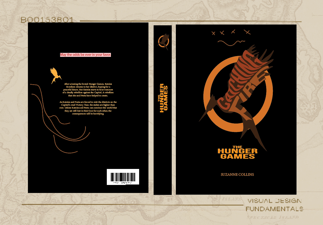
The book Catching Fire, the second installment in The Hunger Games series, is filled with themes of survival, rebellion, and transformation. My initial concept centered around the iconic mockingjay and its role as a symbol of resistance. I envisioned the mockingbird being quite literally set on fire to represent the powerful imagery of rebellion and defiance that is central to the book. The idea of something fragile (the bird) being set aflame felt like a metaphor for the tension between hope and destruction, which I aimed to capture visually.
Creative Process:
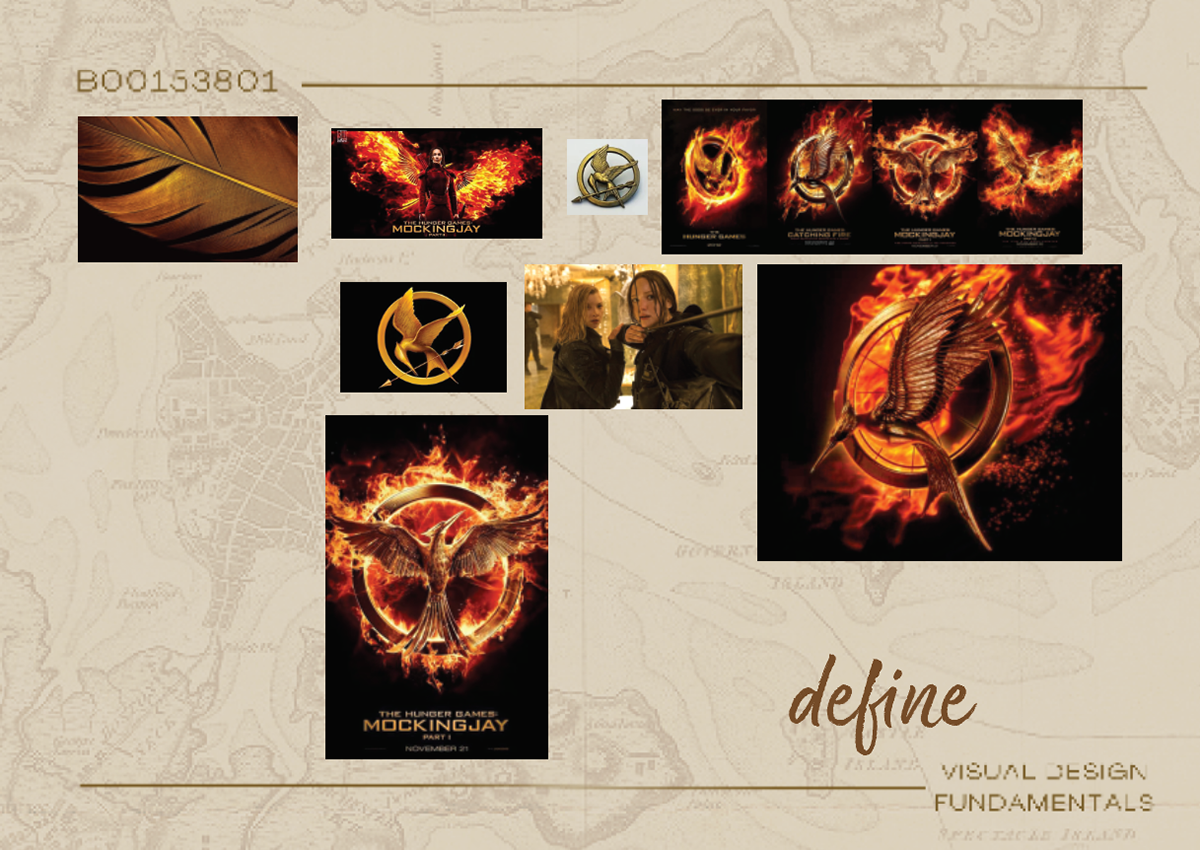
To guide my design, I gathered visual references from the series and explored words like "rebellion," "fire," and "transformation." These ideas helped shape the imagery, emphasizing the contrast between the fragility of the mockingjay and the power of fire.
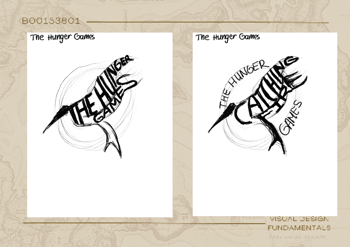
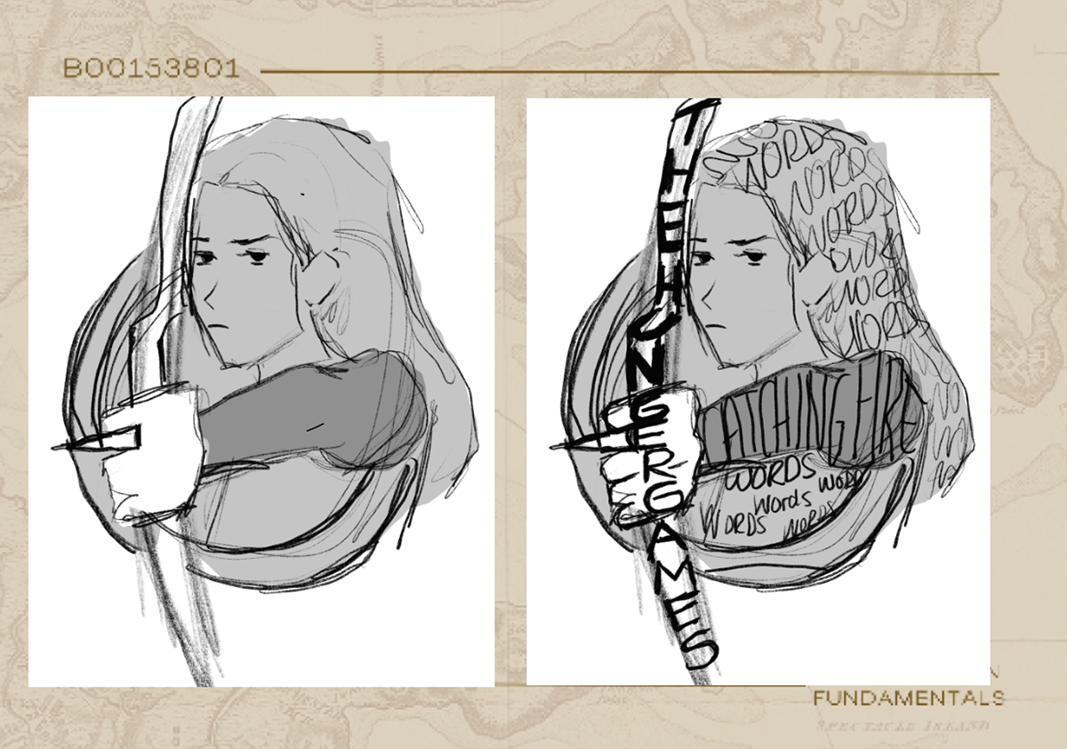
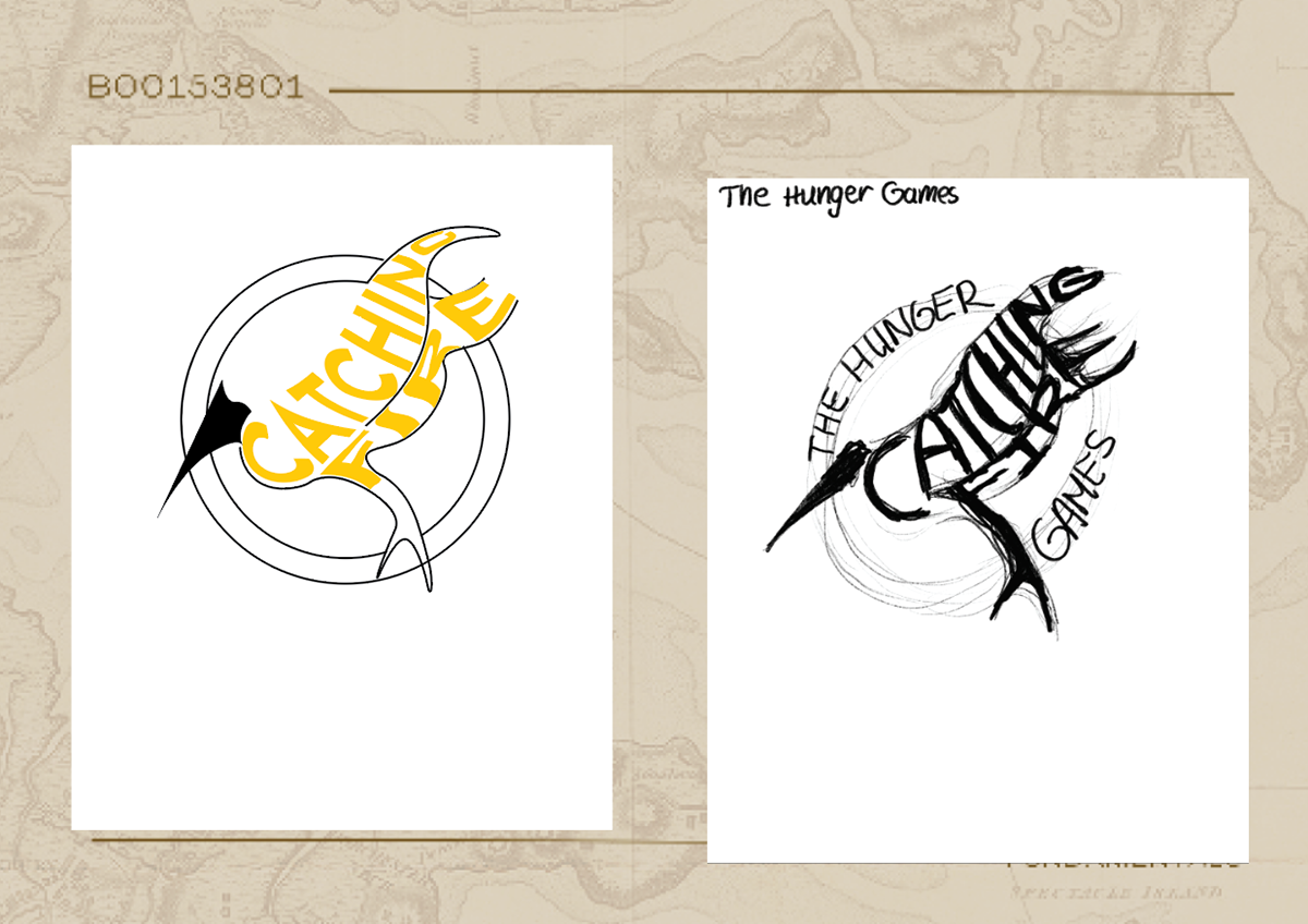
I created multiple sketches to experiment with the composition, playing with different ways the mockingjay could be depicted in flames. I wanted it to feel dynamic and in motion, capturing the intensity of the story’s narrative.
I integrated the typography into the design, manipulating the type to resemble the shape of the mockingjay. The title needed to feel part of the visual narrative, almost as though it was part of the fire itself.
After receiving feedback, I made adjustments, refining the bird's interaction with the flames and ensuring the typography stood out more. I tweaked the composition to strengthen the overall impact.
For the color palette, I chose fiery reds and oranges, contrasted with black to create a striking visual contrast.
Using Procreate, I added texture to the flames and the mockingjay, enhancing the depth and organic feel of the fire. This brought an added layer of energy to the design.
Finally, I brought everything together in InDesign and Illustrator, ensuring the layout was precise and ready for print.
